Tuesday, August 4, 2009


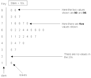
A stem in leaf plot is an easy way to group numbers together and cut down on alot of time and space. This graph shows and tells you exactly how a stem and leaf plt works. You basically put the first number on the outside and the sec numbers on the inside of the line.

http://www.uow.edu.au/student/attributes/statlit/modules/images/2_31.gif

Box ploting is a good way to group numerical values together and through 5 different summaries. It calculates the minumum, maximum, median, and quartile 1 and 3.

Histgrams are used to compare alot of different data and show the variation of a certain variable. This graph shows the average score of the test and the number of students that received those grades.

http://media.techtarget.com/digitalguide/images/Misc/iw_histogram.gif
Parallel Coordinate System is used predominantly in baseball statistics where you are able to show a varies number of stats and being able used in one plot.

http://www.matthewtavares.com/baseball_report/

A triangular plot shows 3 variables and compares this accordingly to their color. This triangular plot has 3 variables and a color sceme of 7 different colors to show the differences.

http://www.pmel.noaa.gov/maillists/tmap/ferret_users/fu_2007/jpgCqrZqdDwYG.jpg
A windrose graph shows the amount and the percentage of wind change is all different directions. You can measure any direction needed to know the wind changes.

http://www.vistadatavision.com/uploads/images/reports/wind_rose_vector_1.png
A climograph shows the climate changes from month to month in the given area. This graph shows the precipiation and the temperature changes on a month to month basis.

http://www.uwsp.edu/geo/faculty/ritter/images/atmosphere/climate/climographs/memphis.jpg

A population profile shows the ranges in population of male and female immigrants and the age of these immigrants. This graph to the left is a great tool to show immigrants and their profile.

http://www.populationaction.org/Publications/Reports/The_Shape_of_Things_to_Come/asset_upload_file420_6098.gif

A scatter plot is just a plot of points on a given graph that shows a certain amount of data. Scatter plots also allow us to find the median of the data even if they spread throughout the graph.

http://www.radicalmath.org/docs/MilitaryScatterplot.jpg

A index value plot shows a stream flow of certain variables with contrasting colors. This graph to the left is comparing the Normalized Daily Index for 6 separate countries to see the flow of the closings.

http://www.mathworks.com/products/demos/shipping/econ/americanbasketdemo_01_thumbnail.png

This is a very basic Lorenz curve that shows two variables being compared through the curve. This graph is comparing the percent of households and there income in this region.

http://wpcontent.answers.com/wikipedia/commons/thumb/b/bd/Lorenz-curve1.png/550px-Lorenz-curve1.png

This bilateral graph is a bar graph that compares different statistics. This graph to the left is showing the environmental statistics for the country of Japan.

A nominal area choropleth map shows the differences in a certain district throughout the state od California. This map shows the percent of black condo owners.

http://my.ilstu.edu/~jrcarter/Geo204/Choro/Tom/calif-correct-4-quartiles%7B2%7D.gif

A standardized choropleth map shows standardized data to help show the difference between two variables. This map of Canada shows the differences in the percentage of youth population throughout the country.

http://www.statcan.gc.ca/pub/92f0138m/2008003/figures/figure3.1-en.jpg

Univariate Choropleth map displays a multiple sets of data and uses varies colors to compare and contrast these areas. The map to the left is showing the different climate classifications throughout the country.

http://www.bom.gov.au/climate/how/newproducts/images/kpn_map.jpg

This bivariate map displays two variables by combining two different sets of colors or symbols. The uses color to show the difference between two different variables to explain the data.

http://www.neighbourhood.statistics.gov.uk/HTMLDocs/images/BP%2520Maps6_tcm97-50746.jpe

A unclassed choropleth map near gives a more specific data by making the areas smaller and more precise.

http://2.bp.blogspot.com/_b_Fy-HKi1ks/STfeaqDiwwI/AAAAAAAAAH4/tMXbnxL1s4s/s320/unclassed.gif

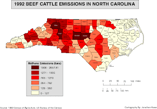
This classed choropleth map shows the beef cattle emissions in North Carolina during a given time. There are colored according the the scale at the bottom left of the map.

http://personal.uncc.edu/lagaro/2101/2101_ProjectsS2001/beefmethaneJMK.gif

A Range graded proportional circle map depicts a certain area and then also shows another map to of that area closer to see the differences. This map is showing the number of EID events that took place.

http://www.nature.com/nature/journal/v451/n7181/images/nature06536-f2.2.jpg

A continuously variable circle map shows data through the marking of how large the circle is. The larger the circle means the more data is in that area. It can measure a variety of different variables.

http://images.google.com/imgres?imgurl

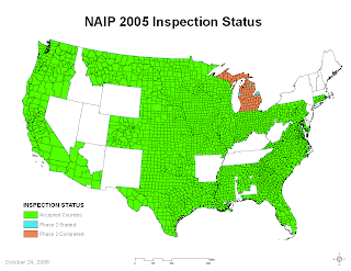
A DOQQ map represents information used to retrieve data. This map on the left is showing the NAIP of what areas they have and have not completed inspections.

http://www.fsa.usda.gov/Internet/FSA_Image/2005_inspect_large.gif

A DEM map stands for Digital Elevation model that shows the elevation changes in a given area. The most common reason for DEM is land survey for construction.

http://www.waialeale.org/graphics/kauaioverview.jpg

This DLG map is showing a high resolution of the elevation changes in the United States. As shown in the map towards the west the elevation is higher than out east. This map will show you where the largest mountains are in this given area.

http://weather.unisys.com/usgs/3sec/usgs-US.gif

A DRG map is a scanned image of US geographical survey of the earths surface. This image to the left is a survey of state of Missouri showing a survey of each area.

http://www.msdis.missouri.edu/data/2foot/images/drg-index-map.jpg

Isopleth maps are used to measure the amount of something is a given region. In meterology it is used to determine sea levels and precipitation. The different shades show the amount of what is being measured. This picture to the left is showing the Ammonium ion concentrate throughout the United States with green signifying the least and orange signifying the most.

http://nadp.sws.uiuc.edu/isopleths/maps2003/nh4.gif

Isotech maps are used to measure the thickness of a certain area. It is used alot of the exploration of oil to see if there is possibility of oil and other underground analysis. This map to the left shows the contours of Rio Blanco Tephra Deposit.

http://www.geo.utexas.edu/faculty/barker/kempter/rbtephra.gif

An isohyet map depicts a certain amount of rainfall for a certain area. As shown in the map to the left with more lines indicting more rainfall on the east side of the area.

http://www.dpi.nsw.gov.au/__data/assets/image/0004/157900/sub-clover-chose.jpg

An isotach map is used for determining the speed in which the wind is blowing. This is how the weather man cna predict what the wind will blow for a certain say. The map to the left is a visual that shows in different areas in which the speed of the wind is different.

http://www.spc.noaa.gov/publications/thompson/3may99/cfig10d.gif

An isobar map is a map used by connecting points with a line that have equal atmospheric pressure. It is used much is determining weather like the picture to the left. It shoes high and low pressure via the red and blue line to show the differences in pressure.

http://www.halesowenweather.co.uk/isobars.gif

LIDAR is a method for decting the distance something is away from an objuect. Lasar light is used to determine where the light is being reflcected that can give u an exact distance from one object to another.

http://www.wy.nrcs.usda.gov/wygis/Lidar.gif

A doppler radar measures the velocity of the system and the radar target. Airborne systems use doppler radar to measure the velocity of a vehicle relative to the earths surface.

http://www.weatherusa.net/blog/images/doppler-orlando-1943.gif

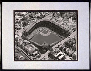
To the left is a black and white areal photo of Wrigley Field. It shows the above view of what the field looks like in black and white format.

http://www.horschgallery.com/admin/uploads/Products/Product184/bw26-black-white-wrigley-field.JPG


Infrared Aerial photos can be used for many different things but one of the most common is in our weather reporting. Infrared detects the amount of heat is a certain area and this helps our weather man to help forcast the weather and possible bad storms. This certain map is the likelyhood of lightening happening in certain areas.

http://sofia.usgs.gov/publications/fs/2004-3016/images/fig3x.jpg

This is a series of maps in which disney depicted the German invasion of Poland in 1939. These types of maps show the animation of the event that is taking place.

http://maps.unomaha.edu/AnimArt/ActiveLegend/Peterson.html

A statistical map is a map that shows a cetain statistics such as: amount of rainfall, population, or crops in a certain area. This statistical map is showing the number of flood insurance claims throughout the United States. As you can see the top 3 states are Florda, Louisiana, and Mississippi. These states are hit by hurricanes during this time of year.

http://slabbed.files.wordpress.com/2008/04/totclaims2005sm.gif

A cartogram map shows the distribution in certain regions not in the normal map size. This map is very unique in the fact that it is showing the electoral votes and the importance of them is shown by which states are larger. Each square represents one electoral vote and with that being the case it shows the public the importance of that given state.

http://vis.berkeley.edu/courses/cs294-10-fa07/wiki/images/a/ae/NYTCartogram2000.jpg


http://vis.berkeley.edu/courses/cs294-10-fa07/wiki/images/a/ae/NYTCartogram2000.jpg
Flow maps are a mixture of maps and flow charts to show the movement from one place to another. This flow chart is measuring the amount of flow in which Texas has. The United States Dept of Transportation measures this to keep accurate recording of where goods come and go from.


http://www.lib.utexas.edu/maps/texas/combtrk_tx_1998.jpg

An isoline map shows a contrast along a curve which the finction has a constant value. This map is showing the difference in the climate which shows different plant hardiness. It shows the avergae minimal temperature in which plants in these areas can survive.

http://www.uwsp.edu/gEo/faculty/ritter/geog101/textbook/essentials/usdahardinesszones440a.jpg

This proportional map displays its data in relation to the size of the circle. In the map to the left it is comparing the American Indian population in those states highlighted yellow and the larger the circle is great Indian population there is.

http://www.neiu.edu/~nerobert/391/Circle%20Map.jpg

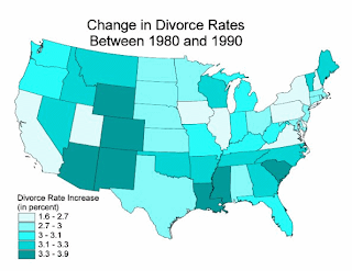
This choropleth map is a map showing varies densities throughout the regions in divorce rates. You can see the more highly shaded regions have had more change between 1980 and 1990.

http://www.pop.psu.edu/images/gia/maps/changeanim.gif

This is a dot distribution map that is showing the population of the United States in 2000. As you can tell the highly dotted areas throughout the country are your major cities.

http://www.census.gov/geo/www/mapGallery/images/small2kden.jpg

A propaganda map is used as a selling tool to get a certain point across to someone. Propaganda maps are no different that billboards, but they are visualizing a certain area through the map.

http://victoriansatwar.net/archives/pics/46.jpg

A hposometric map depicts a certain area and the configuration of the earths surface. It uses shading and tinting to show the contours of that area.

http://images.google.com/imgres?imgurl=http://geology.com/news/images/shaded-relief-map.jpg&imgrefurl=http://www.csulb.edu/~rodrigue/geog140/lectures/symbolism.html&usg=__frwc-GvUuwOjbrcOUd5S2ymhQfg=&h=500&w=500&sz=91&hl=en&start=8&um=1&tbnid=NbG3Czr62hBjUM:&tbnh=130&tbnw=130&prev=/images%3Fq%3DHypsometric%2Bmaps%26ndsp%3D18%26hl%3Den%26client%3Dfirefox-a%26channel%3Ds%26rls%3Dorg.mozilla:en-US:official%26sa%3DG%26um%3D1

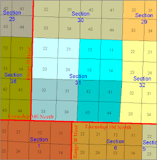
This PLSS map is a land surveying map that breaks down the sections for certain townships. It breaks down a certain area to mark it.

www.fairview-industries.com/.../mn-exmp2.gif

A cad astral map is a map that shows ownership of a property. It gives the boundaries for which a certain ownership occurs.
upload.wikimedia.org/wikipedia/commons/thumb/..

This thematic map is a visual indication of the soil moisture throughout the United States. It uses varies colors to show the difference from region to region.

http://soils.usda.gov/use/thematic/images/drought_1_gen_area_map.jpg

This topographic map shows qualities that the map below does not. Topographic maps show the elevation changes(vertical), which is not depicted in planimetric map. This is the elevation changes in Brazil.

http://www.brazadv.com/images/topographic%20map%20brazil.jpg

This is a planimetric map that uses only horizontal features to depict the image without regard to elevation.

http://www.loc.gov/rr/geogmap/guide/gm058002.jpg

This mental map is a description of China's view of the rest of the world. The map is linked with articles looking at how China precieves actions from over seas.

http://kelsocartography.com/blog/wp-content/uploads/2009/03/chinaeconomiststeinberg.png